Compare/Contrast Diagrams
Introduction and Best Uses
There are many different formats for compare/contrast diagrams. As their name suggests, these graphic organizers are used for comparing and contrasting two concepts, events, objects, or other entities.
Simple Compare/Contrast Format

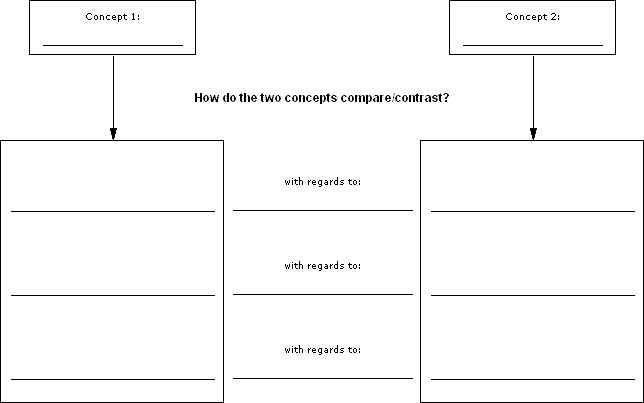
This first and simplest compare/contrast diagram shows two concepts, each with its own column (see Figure 1). Between the left concept's column and the right concept's column is another column reserved for naming the aspect of the concepts being compared or contrasted. For example, if your two concepts were Honda Civic and Volkswagen Jetta, the aspects you might compare/contrast could be price, safety, and standard features. Under each concept column, on each side of the named aspects, is a space to describe those aspects of each concept.
Separate Similarities and Differences Format

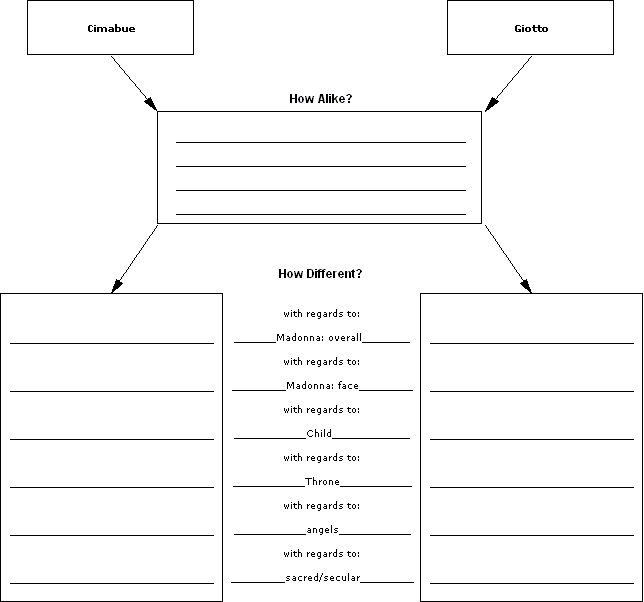
The second compare/contrast diagram is a little more complex, in that it separates the similarities of the two concepts (comparisons) from the differences between the two concepts (contrasts). As Figure 2 illustrates, each concept has its own column, one on the left and one on the right. Beneath the identification of the two concepts, the columns narrow to a single box labeled "How Alike?" in the middle; this is where you list attributes shared by the two concepts, i.e., things they have in common. Under that box, the two concepts branch off again, much like the simple diagram above; this section, labeled "How Different?", is where you list the aspects you wish to contrast about the two concepts, i.e., the things that make them different. Describe those differences in the space next to each aspect within each concept's own column.

Figure 3 shows a partially filled-in diagram comparing and contrasting two works of art. Note that the names of the two works appear in the top boxes, and that the aspects about which they will be contrasted are specifically listed in the aspects column, i.e., with regards to:
- Madonna: overall
- Madonna: face
- Child
- throne
- angels
- sacred/secular
Table Format
Sometimes the easiest way to express in-depth comparisons is via a table. In this format, there are at least three columns. The first column holds the specific aspects in regards to which the entities are being compared. In the next two columns, you will place the data pertinent to each entity being compared regarding each aspect. As Figure 4 shows, this format can even be used to compare more than two entities at a time.
| Aspects to Compare | Nuclear | Solar | Wind |
|---|---|---|---|
| Cost of Initial Investment |
|||
| Availability of Energy Resource |
|||
| Current Installed Base |
|||
| Environmental Impact |